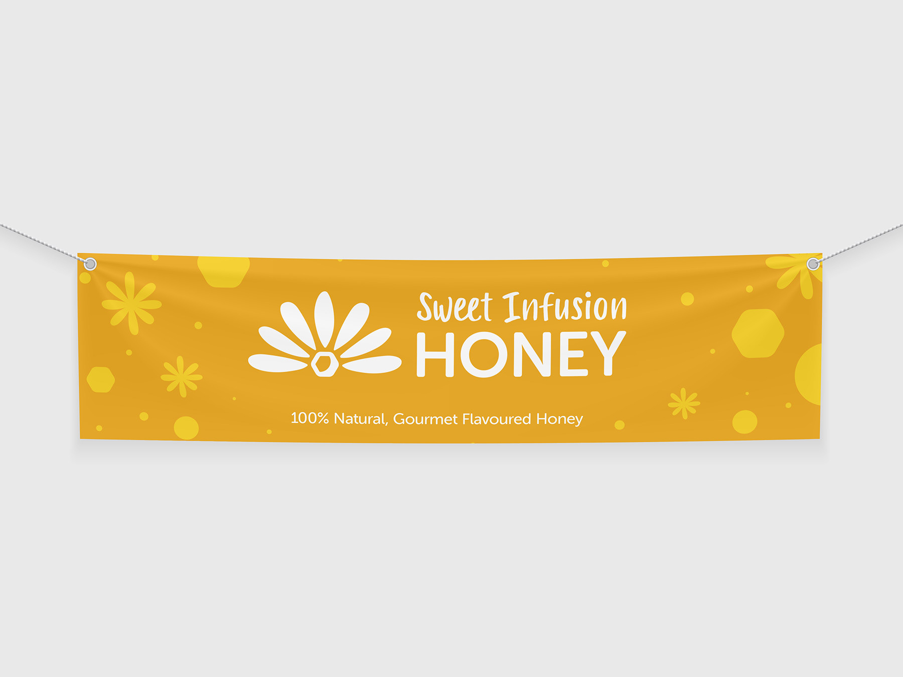
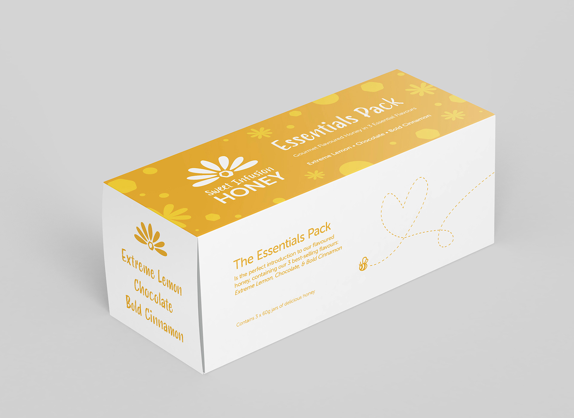
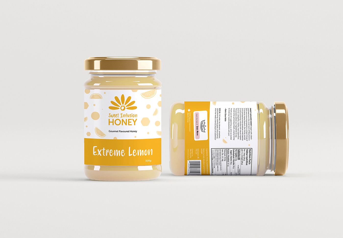
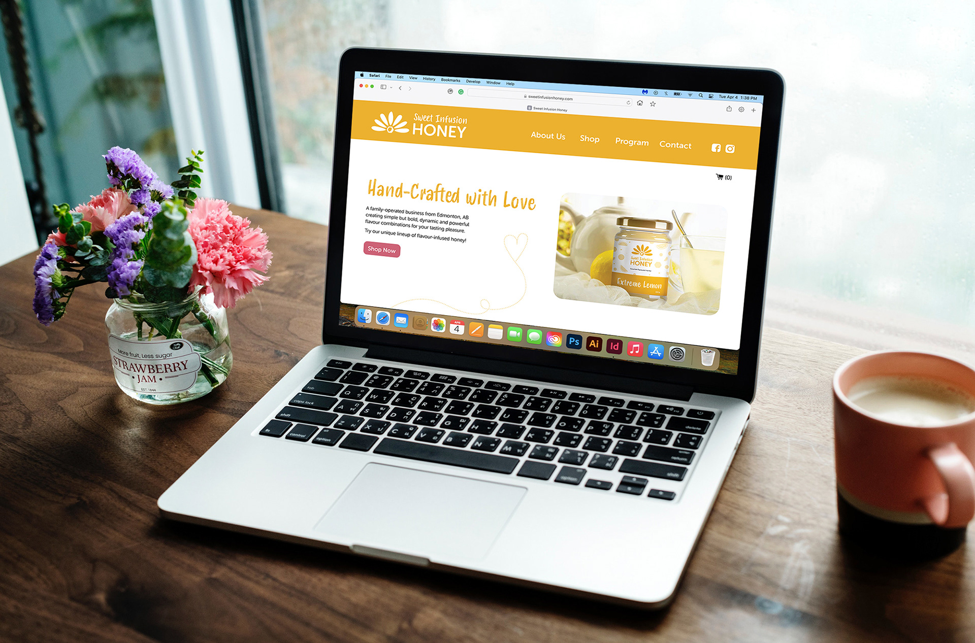
Sweet Infusion Honey is a small company making all-natural flavoured honey. The goal of this project was to hypothetically redesign a company's branding, creating a new logo, visual system, and collateral materials.
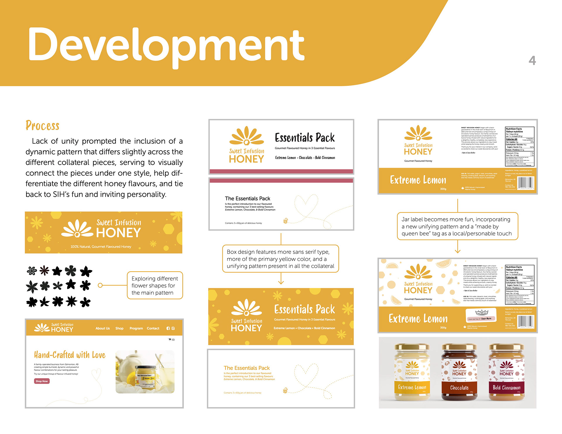
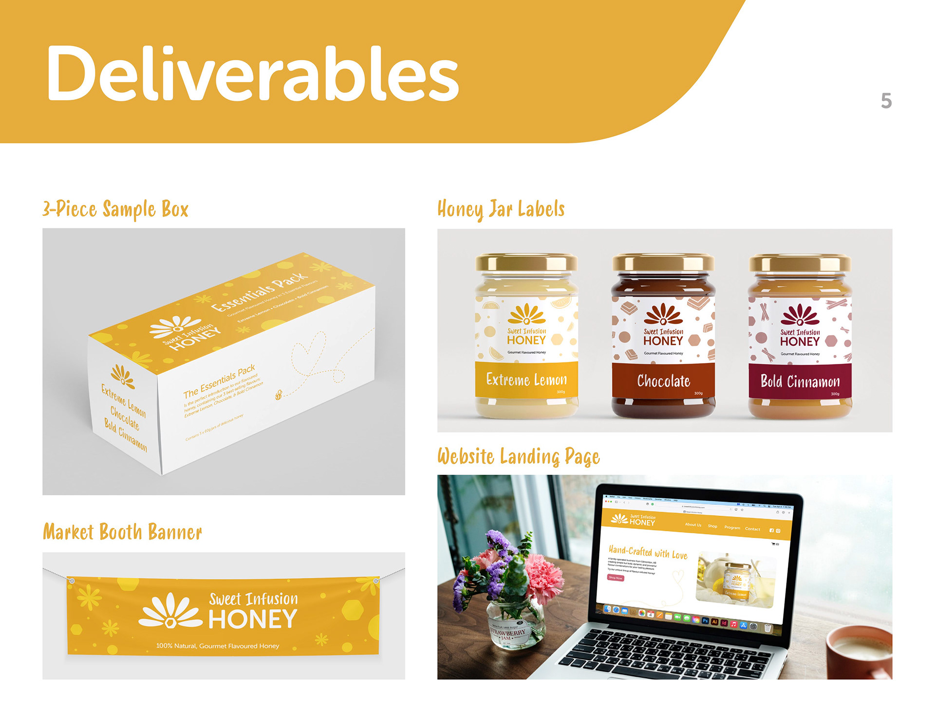
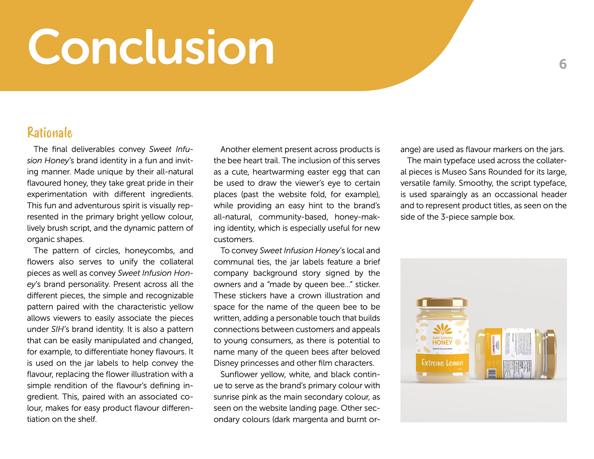
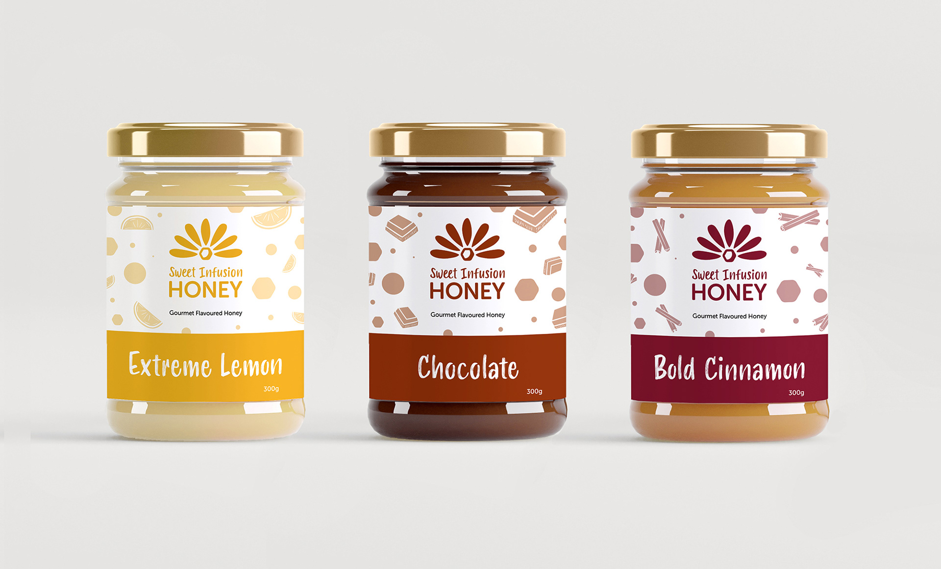
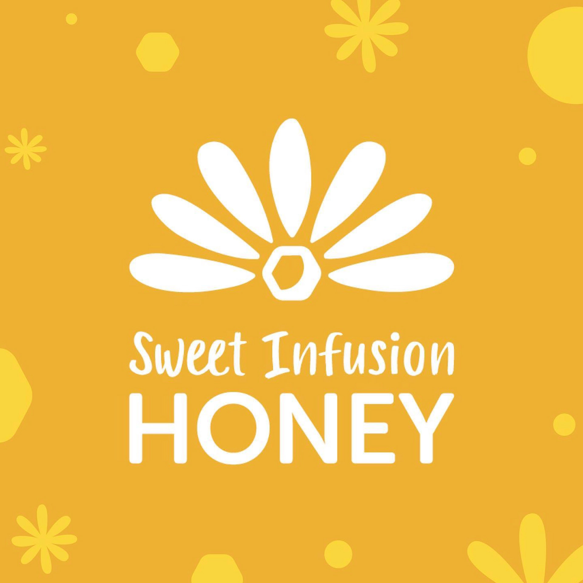
This redesign relies on bright colours inspired by nature to communicate the brand's youthful, adventurous, and all-natural identity. Shapes are soft and organic, inspired by the local environment and its beauty. The collateral pieces are connected by a system of fun, handwritten text, colours, and a dynamic pattern of simple icons. As a company heavily tied to the local community, the packaging features personal touches, such as a signed "thank you" message and "Made by Queen _____" stickers on the jars.
Before
The Redesign
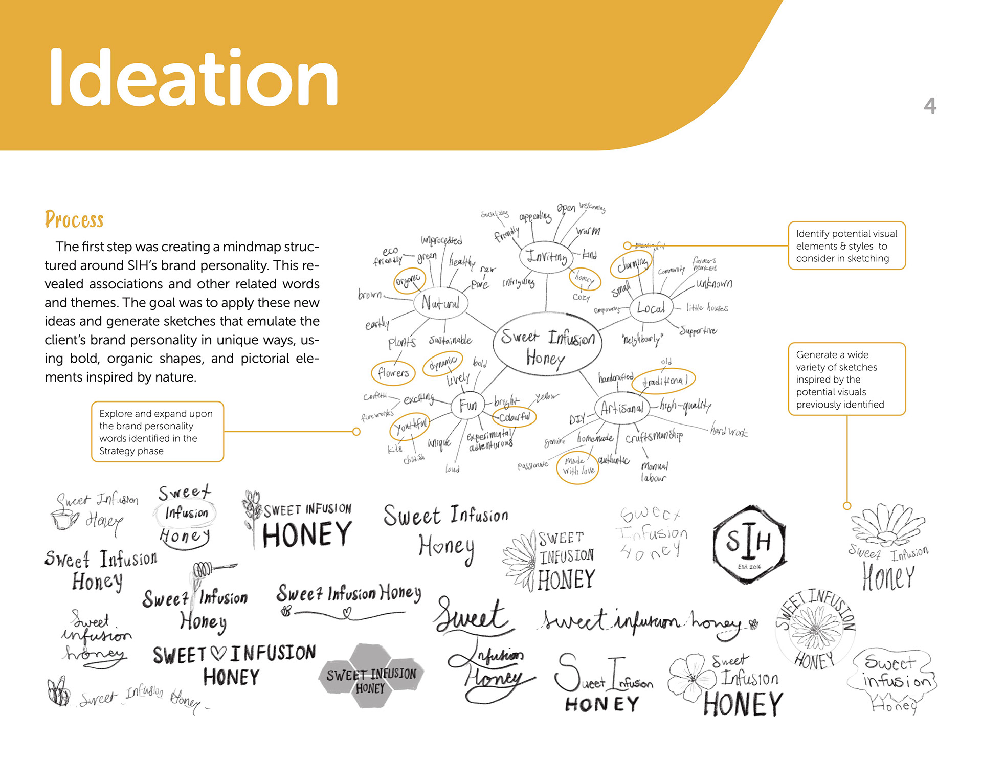
Process Books