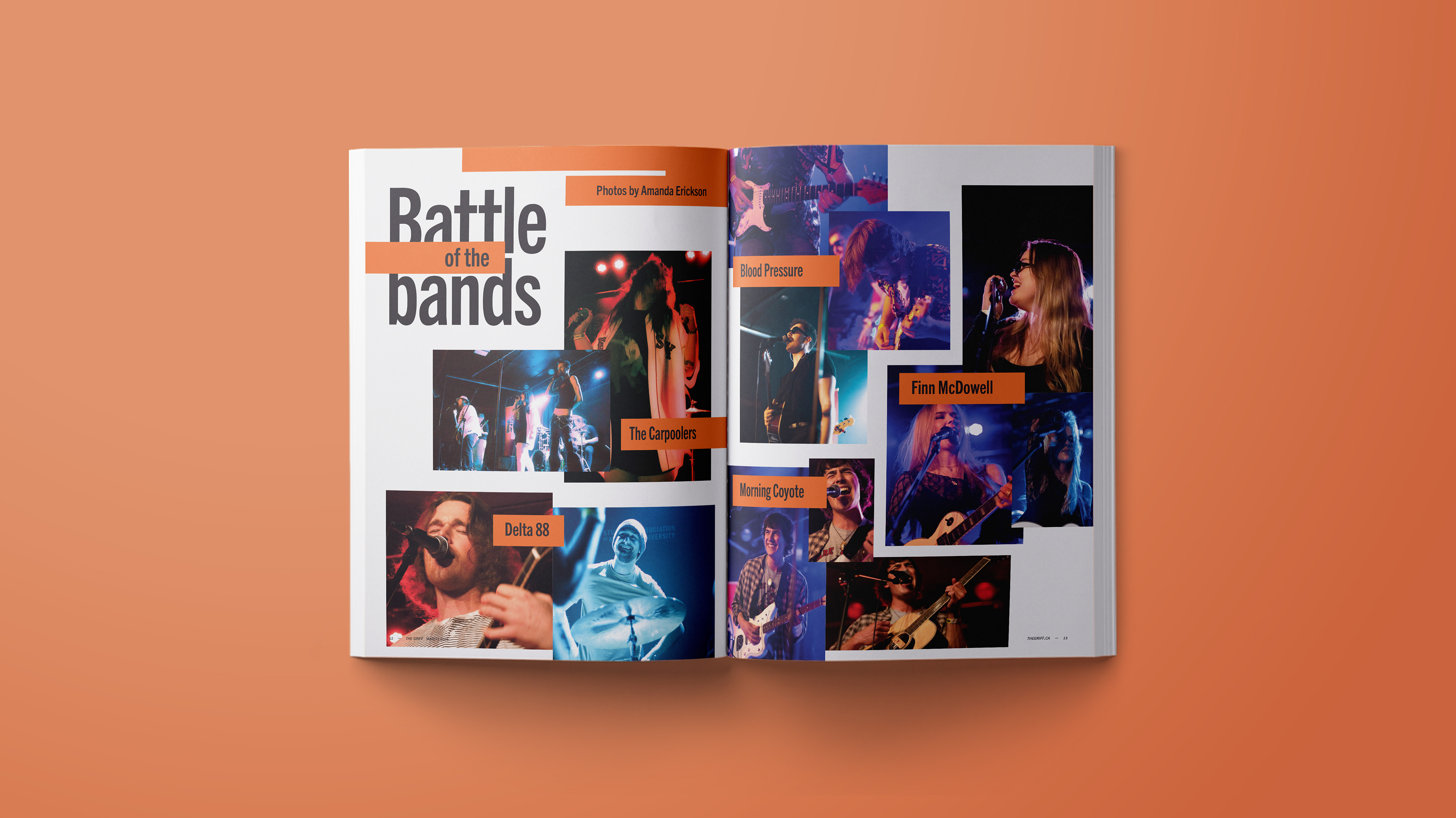

This redesign of the existing Griff Magazine is inspired by the MacEwan student community and its strong, interconnected support system. As students find comfort in leaning on and uplifting each other, so do the elements of the magazine. Text, images, and rectangular shapes interact with each other as the building blocks of each spread, layering, reinforcing, and framing to create a structural soundness reminiscent of downtown’s signature highrises.
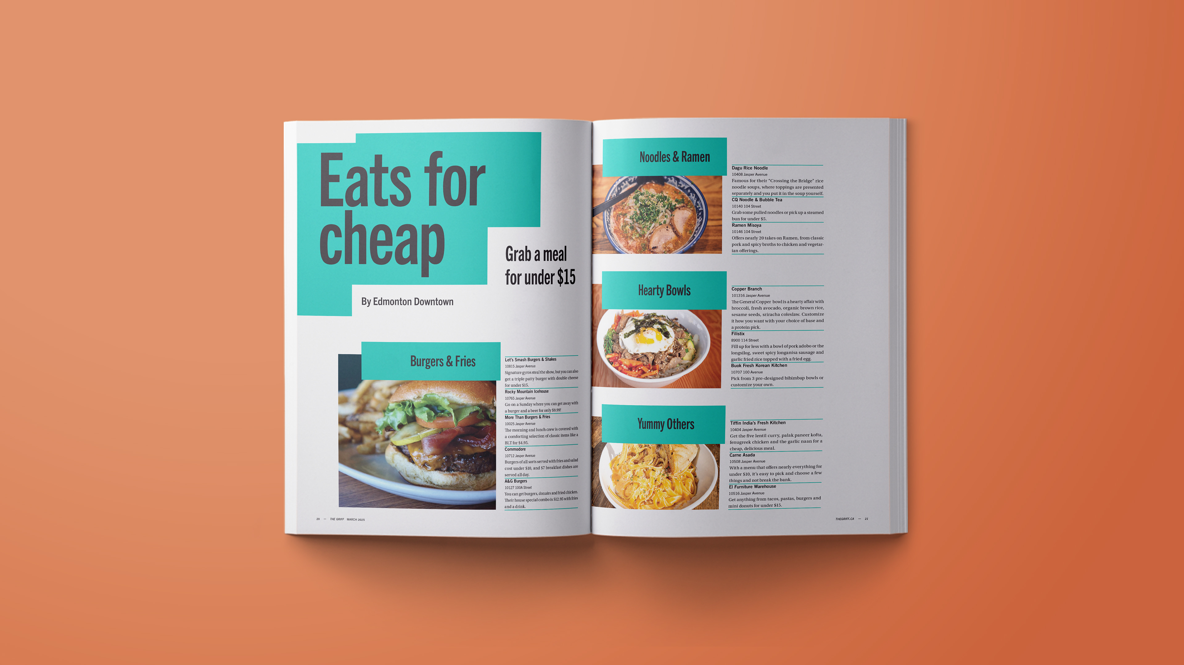
Rectangular shapes act as a connective feature throughout The Griff, leading the viewer’s eye through stories, emphasizing important information, and framing headlines. Additionally, the structural shapes evoke a sense of strength, resilience, support, and diversity as they form various overlapping and interlocking shapes — a reflection of the student community’s principal qualities.
Trade Gothic, with its tall x-height and bold, angular geometry, echoes the verticality and shape of strong buildings, tying back to the supportive community concept and fitting seamlessly into the rectangle motif. Trade Gothic also possesses a hint of quirkiness and character through its subtle irregularities, giving it a humanistic, approachable quality that welcomes its audience. Similarly, the rectangle shapes are utilized to interlock and frame other elements, suggesting a humanistic embrace that contrasts its angular features.
A vibrant colour palette also helps to soften the rigidity of the rectangles, conveying a lively, welcoming environment amidst the strong geometry. The colours also serve to separate the parts of the magazine. A spread’s primary colour positions it as front, middle, or back matter for easy navigation, making The Griff a colourful avenue of structure and communal support for students to indulge in.