
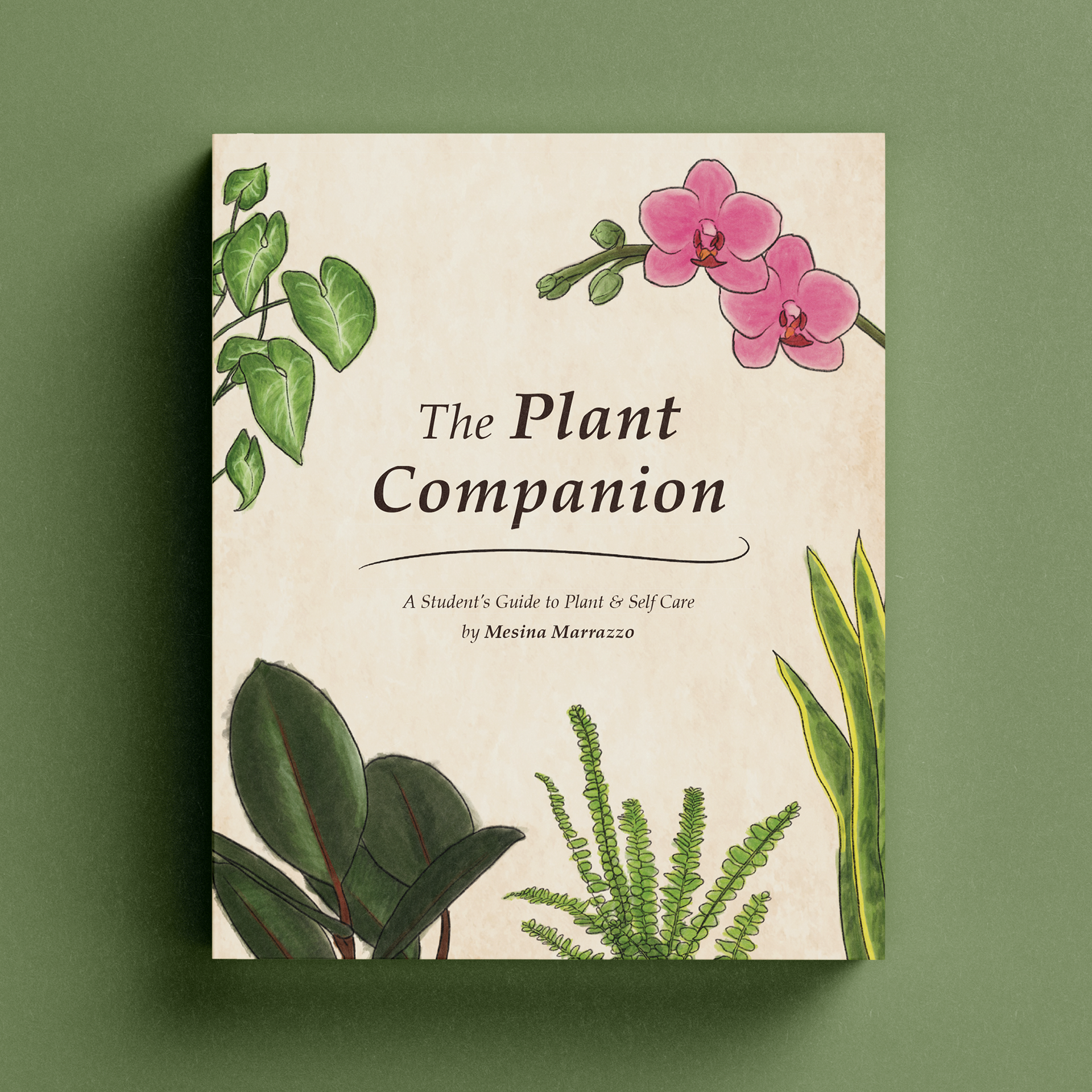
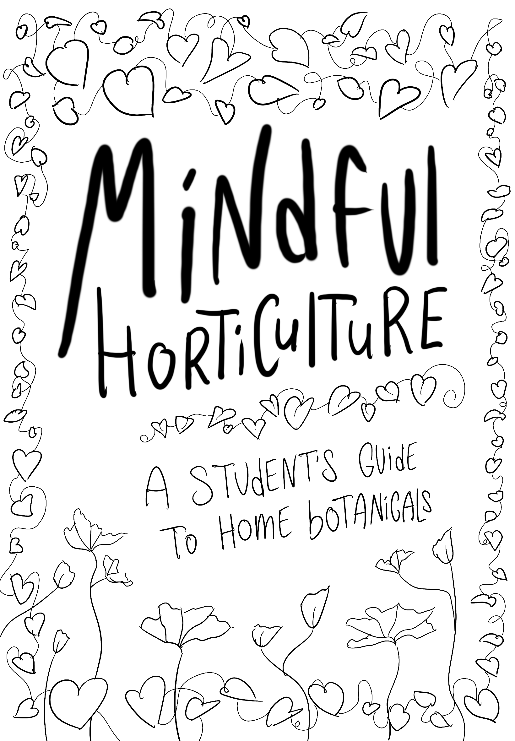
The Plant Companion is a plant guidebook designed for university students to improve their mental health. It offers a wealth of plant care information and a selection of species chosen for their compact size, tolerance, and aesthetics.
My goal with this book was to encourage students to bring plants into their workspaces, as they offer a multitude of physical and psychological benefits. In this book, plant care is a form of self-care! The visual style and content of the book were created to improve mental well-being through relaxing watercolours and lots of balanced white space.
Research Process
Introduction
Mental health among adults is a growing concern, particularly as many people shift toward increasingly online lifestyles. As a result, these individuals spend a lot of time indoors and become susceptible to various mental and physical issues such as insomnia, irritability and decreased immunity. Students, especially, are prone to these issues as well as high stress as they simultaneously balance school and work.
Numerous studies have demonstrated that plants offer a range of benefits — some of which may help mitigate these side effects — including a relaxed physiology, enhanced cognition, and improved blood pressure. This makes having houseplants a great tool for those who spend a significant amount of time indoors. However, many people may be daunted by the prospect of caring for a plant. In this project, I aim to promote positive, fruitful relationships between students and indoor horticulture.
Research
Design Question
How can design research help promote positive, fruitful relationships between students and indoor horticulture?
Project Goals
• Highlight the benefits of houseplants
• Understand both the desirable and undesirable aspects of plant care
• Identify ideal beginner plants for students to care for
• Find design opportunities and potential solutions to promote positive, fruitful relationships between students and indoor horticulture
Design Methods
Survey
My first research method was a brief 11-question survey distributed across Instagram, Reddit, and Discord. The intent was to collect demographic information about post-secondary students, their mental health, and how they manage it, as well as their at-home workspaces and the work conducted in them, and to gather current understandings of indoor horticulture.
Results
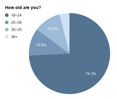
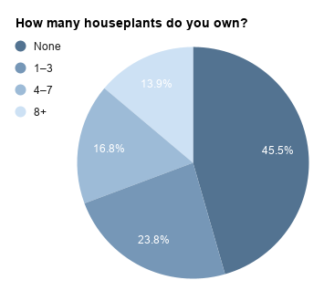
A quantitative analysis of the 101 responses received revealed information about the demographic’s age range, school and work situation, average time spent working at home, and plant ownership.
A staggering majority of respondents are under 35, with the most common age range being 18-24. 92% are full-time students, and 41% report having a job in addition to their school responsibilities. Time spent working at home shows great variation between individuals; however, most reported 15-20 hours of schoolwork per week, followed closely by 10-15 hours. When asked about the number of houseplants owned, just over half responded that they have at least one plant in their care. Their reasons for not having any plants vary, but the most common were a tendency to kill them, a lack of knowledge about plant care, the associated workload being too large, and a lack of space for them.
This data reveals important information about the demographic to which the design outcome will be aimed, allowing me to tailor the outcome and its delivery to their specific needs. Students struggle to keep plants alive and find the time and space to care for them, so the plants I include in my design outcome should be low-maintenance, very tolerant, grow relatively slowly, and remain tall rather than wide to conserve space.

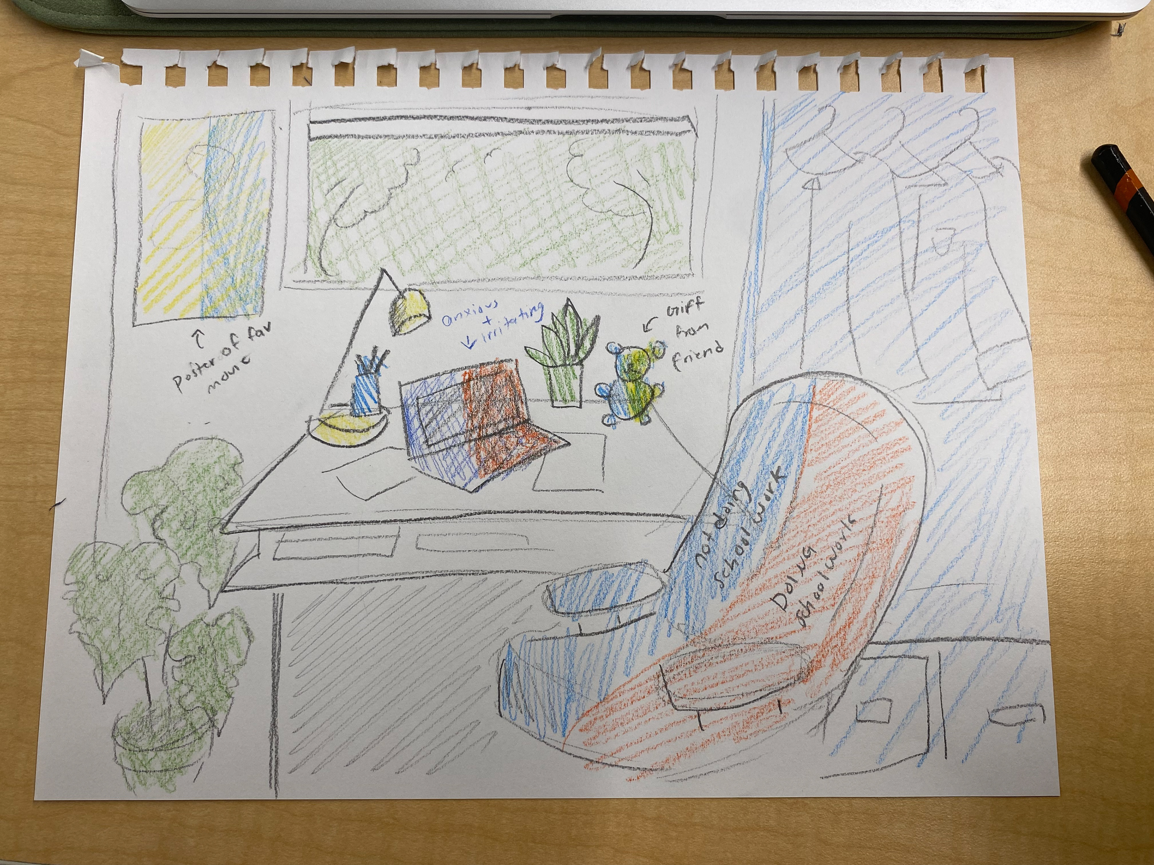
Workspace Geography
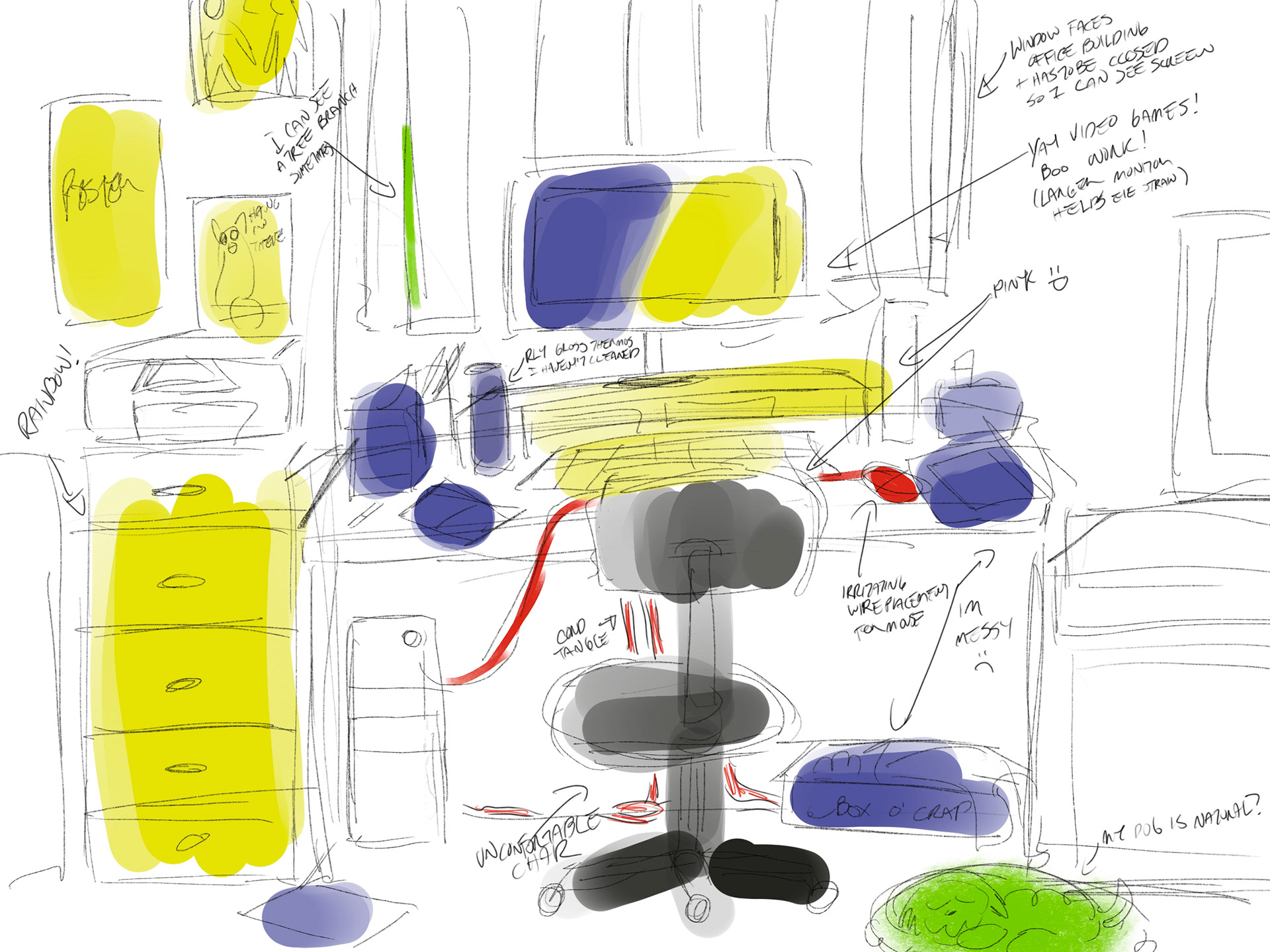
This research method asked participants to sketch a recreation of their at-home workspaces, then colour-code specific items or areas in their sketch based on any emotions associated with them. This gave me some insight into the appearance and organization of student spaces and how they feel working in them.
Results
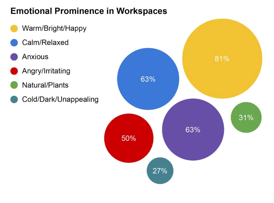
A qualitative grid analysis of the 12 submitted drawings revealed insights into the spaces and environments where students work and how they feel about working in them. The colour most used by students in this exercise is yellow, indicating feelings of warmth, happiness, and brightness as the most prominent. This is followed by a perfect tie between anxiety and calmness, both sitting at 63%. By far, the most common source of anxiety is a computer because of its association with academics and homework. Fortunately, many students will surround their immediate workspace with objects that produce a calming or happy effect, such as posters, desk trinkets, headphones, and a comfy seating arrangement.
This data reveals important information about the appearance and layout of student workspaces, which will help in determining the different types of plants included in the design outcome. With yellow being the most prominent colour, it indicates that most workspaces are relatively bright and will be conducive to certain plant species. It also offers insight into the myriad of feelings students experience in their spaces. Since they spend many hours a week in these environments, understanding how specific areas and objects affect their feelings will help inform the design outcome. Given that the main source of anxiety is a computer, which is front and center in most spaces, it would be beneficial to counter those feelings with a nearby plant, so I should focus on small, desk-size plants. Familiarizing myself with the structure of these spaces will allow me to curate an effective and suitable selection of plants that fit the average student’s environment.
Interview
The goal of the interviews was to collect information about how students perceive plants and the care involved with them, their likes and dislikes surrounding plants, mental health management, what their at-home work environment is like, and the attributes they associate with “the perfect plant.” Interviews lasted 10 to 25 minutes and included alternate questions depending on whether the participant owned any plants.
Results
A qualitative affinity diagram analysis of three interviews revealed information about the target demographic’s likes and dislikes surrounding plant care, the growing environment of their workspaces, and the qualities they attribute to the ideal plant. The diagram colour codes the sticky notes by responses from those with plants (blue) and those without plants (orange). The responses have been organized into different themed groups, like plant knowledge, emotions/feelings, design ideas, and time restraints.
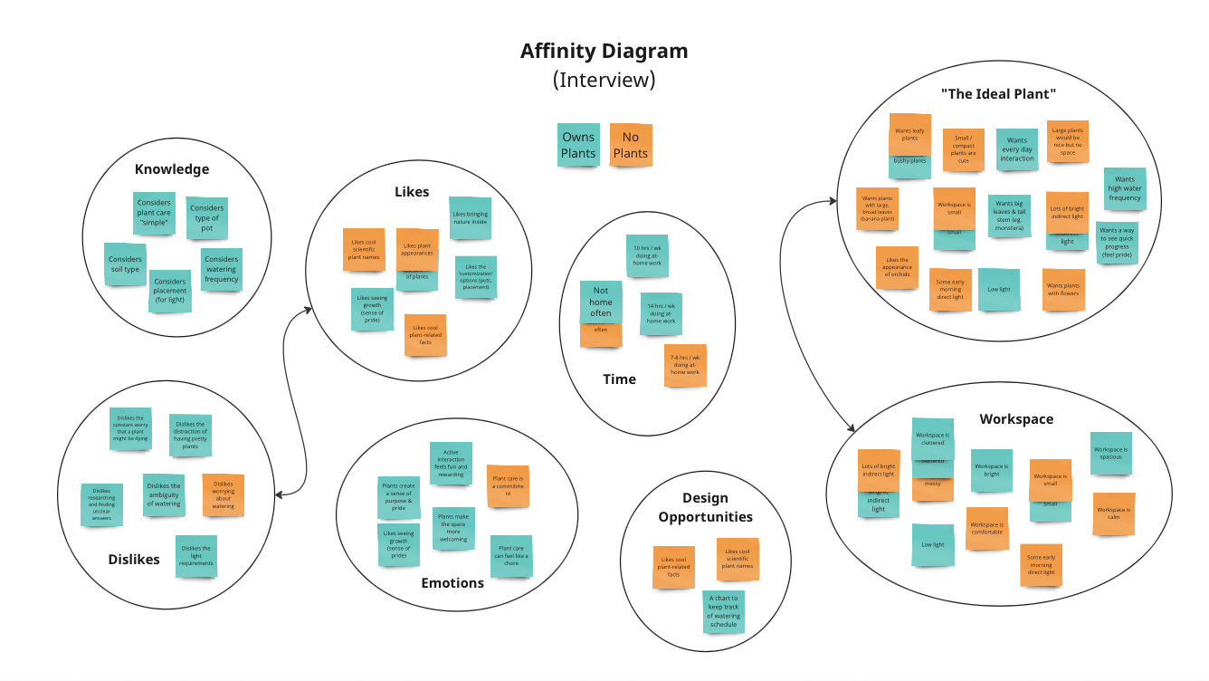
Stacked sticky notes indicate responses that have been repeated, indicating greater importance as interviewees unanimously agree on certain points. This includes workspaces being very small, not being home often, receiving mostly indirect light, and a preference for leafy, tropical plants.
Since the interviewees already express knowledge of basic plant care (watering, lighting, soil), those topics may not have to be covered as in-depth as others, such as repotting, fertilizing, and addressing various pests. As most students agree their spaces are cluttered, small, and receive low levels of indirect light, I should find plants that fit these environmental descriptors. Alleviating challenges such as not knowing when to water and struggling to find answers on the internet will be essential in ensuring my design outcome makes plant care easier and more appealing.
The bulk of responses, however, contributed to defining the “ideal plant.” Many agree on indirect light, plants that fit in small places, and leafy/bushy-looking plants. This will help identify the kinds of plants to include in my design outcome.
Participatory Action
For this method, participants with little to no experience in plant care received a small plant to care for over the course of one week. They received a small card with brief care instructions that listed the plant’s watering, light, and general temperature and humidity requirements. Participants were interviewed before and after, and asked to complete a daily log of three questions while they had the plant.
The goal of this method was to observe how introducing a plant to a work environment affects students and to make caring for a plant easier and more beneficial.
Results
A qualitative affinity diagram analysis of three participatory action studies revealed information about the target demographic’s difficulties and positive experiences with plants. The responses are colour-coded to indicate whether they occurred before (blue), during (purple), or after (pink) the activity. They are grouped into themed categories such as difficulties, design opportunities, qualities of the perfect plant, workspace descriptors, and any positive thoughts or interactions from the activity. The students’ difficulties primarily consist of a lack of knowledge, low confidence in their ability to care for a plant, and general concern about killing a plant.
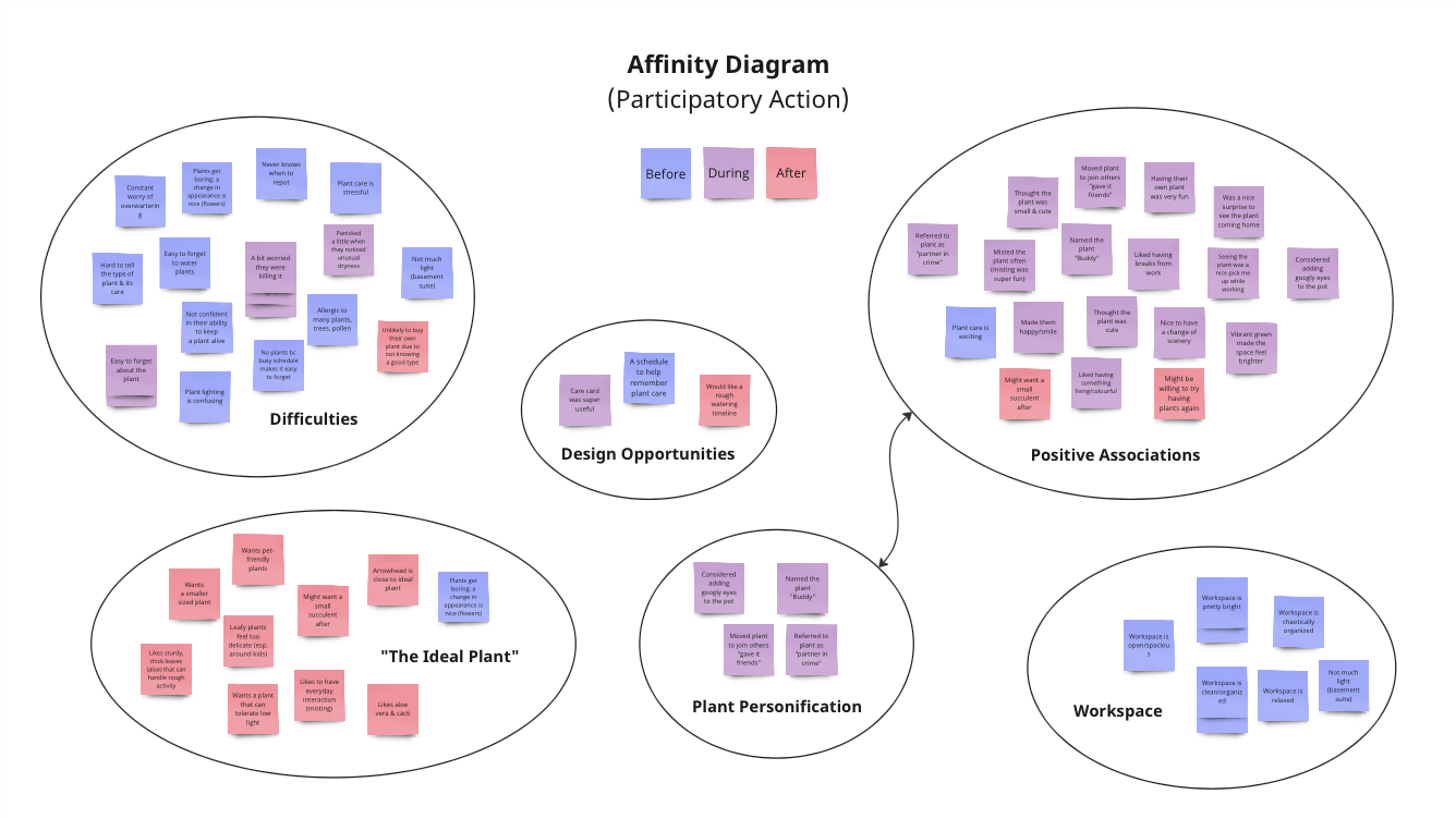

Stacked sticky notes indicate responses that have been repeated, suggesting a greater level of importance as participants agree on certain things, such as being worried that they were killing their plant, easily forgetting about it, and not knowing when to water.
The “difficulties” group, which is mostly blue with some purple, and the “positive associations” group, which is mostly purple with some pink, indicate that the students’ experience was very positive during the activity, despite the various struggles identified prior. This confirms that adding a plant to a student’s workspace will have positive effects.
Suggestions from the students to improve the experience included a troubleshooting section to address common indicators of poor plant health, a schedule to keep track of watering, and an in-depth explanation of when and how to repot.
Design Outcome
Based on the results of my research, it is evident that students struggle with interpreting plant care and applying their knowledge with confidence. They struggle to find all the information they need in one place and often have only a limited understanding of the wide-ranging requirements of plant care, as seen in the “plant knowledge” category of the interview affinity diagram. Putting all this essential information in one easily accessible place will solve this problem.
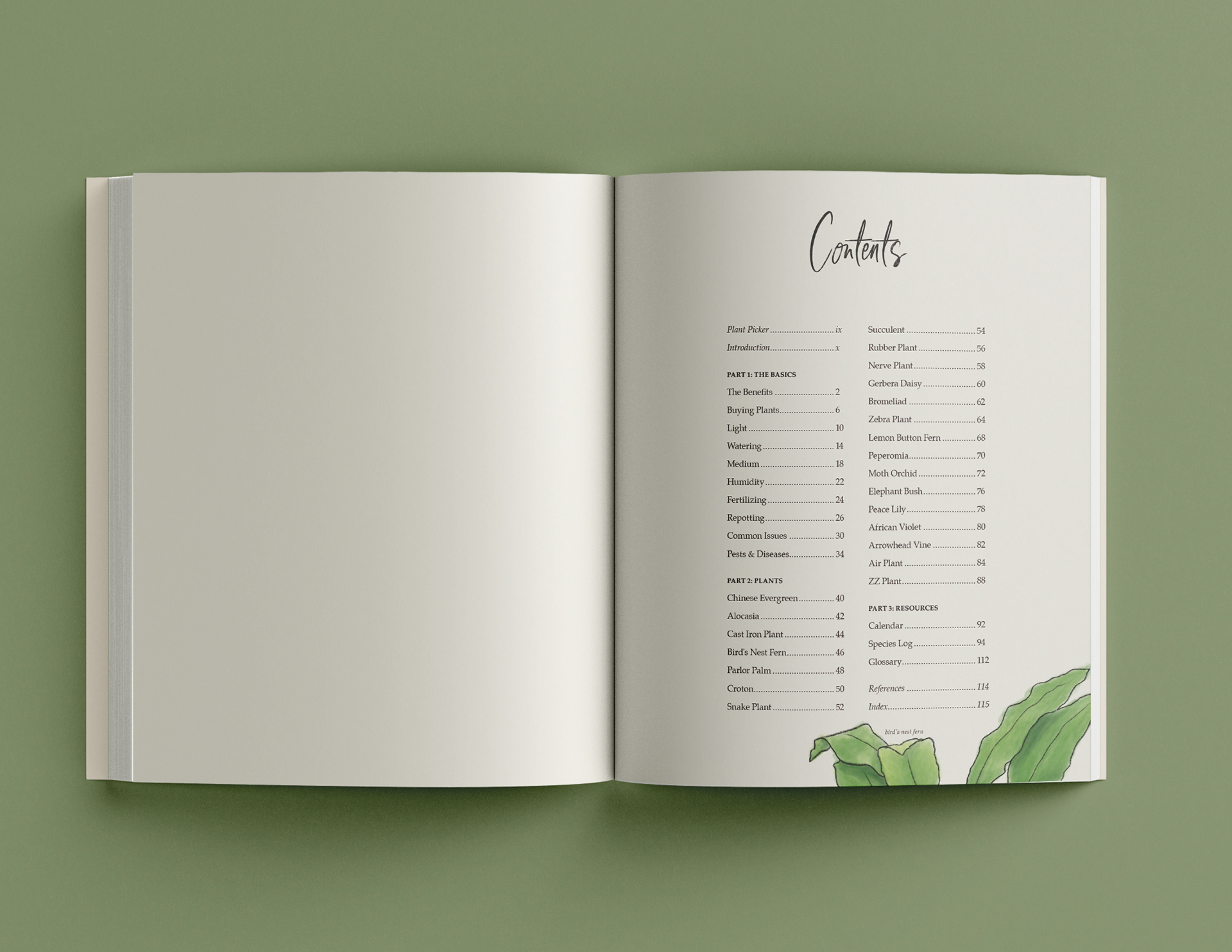
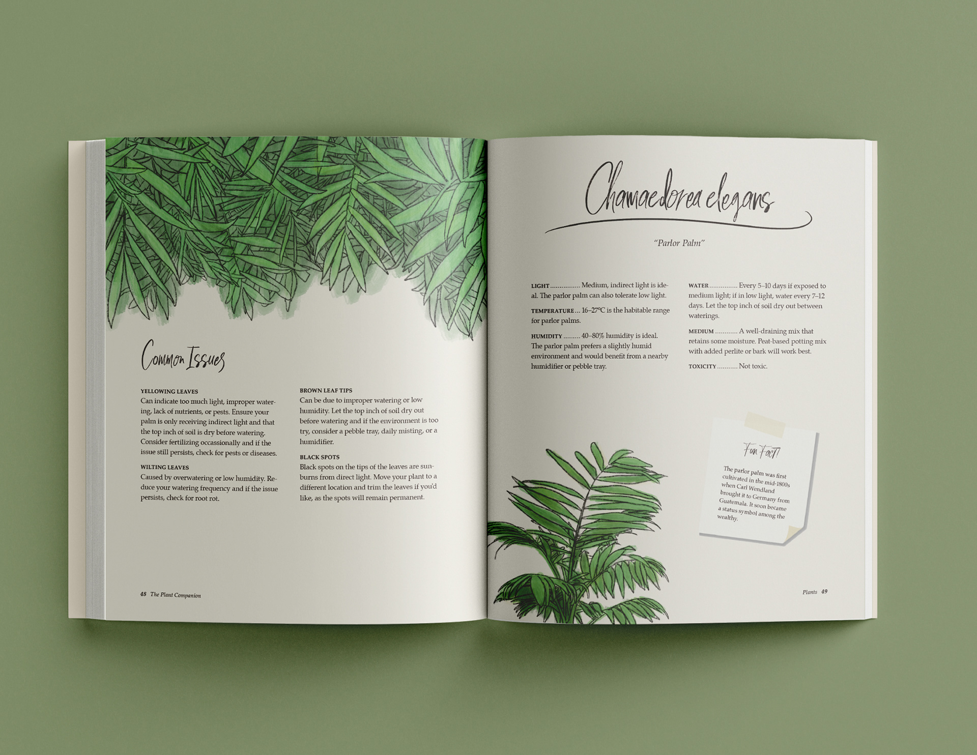
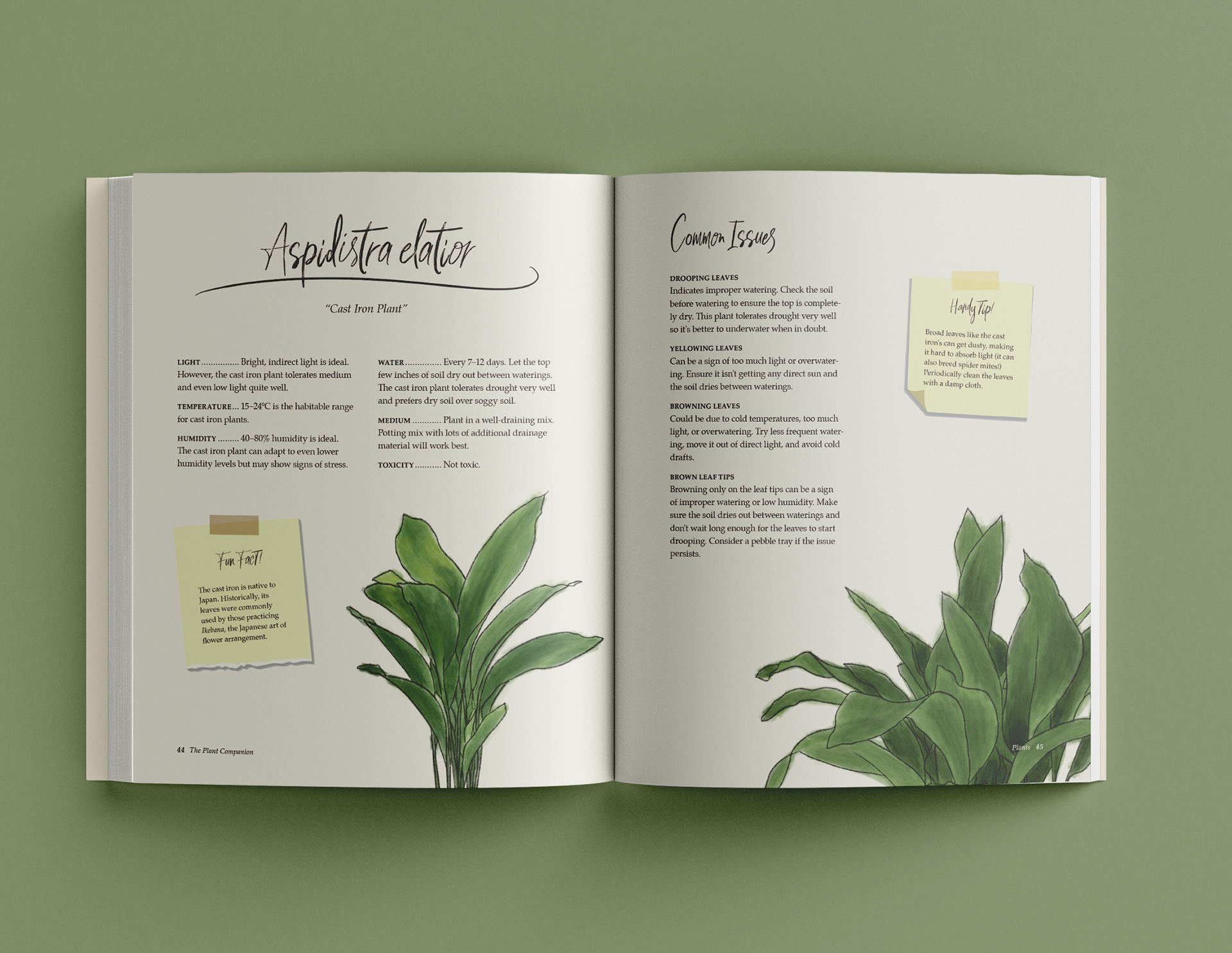
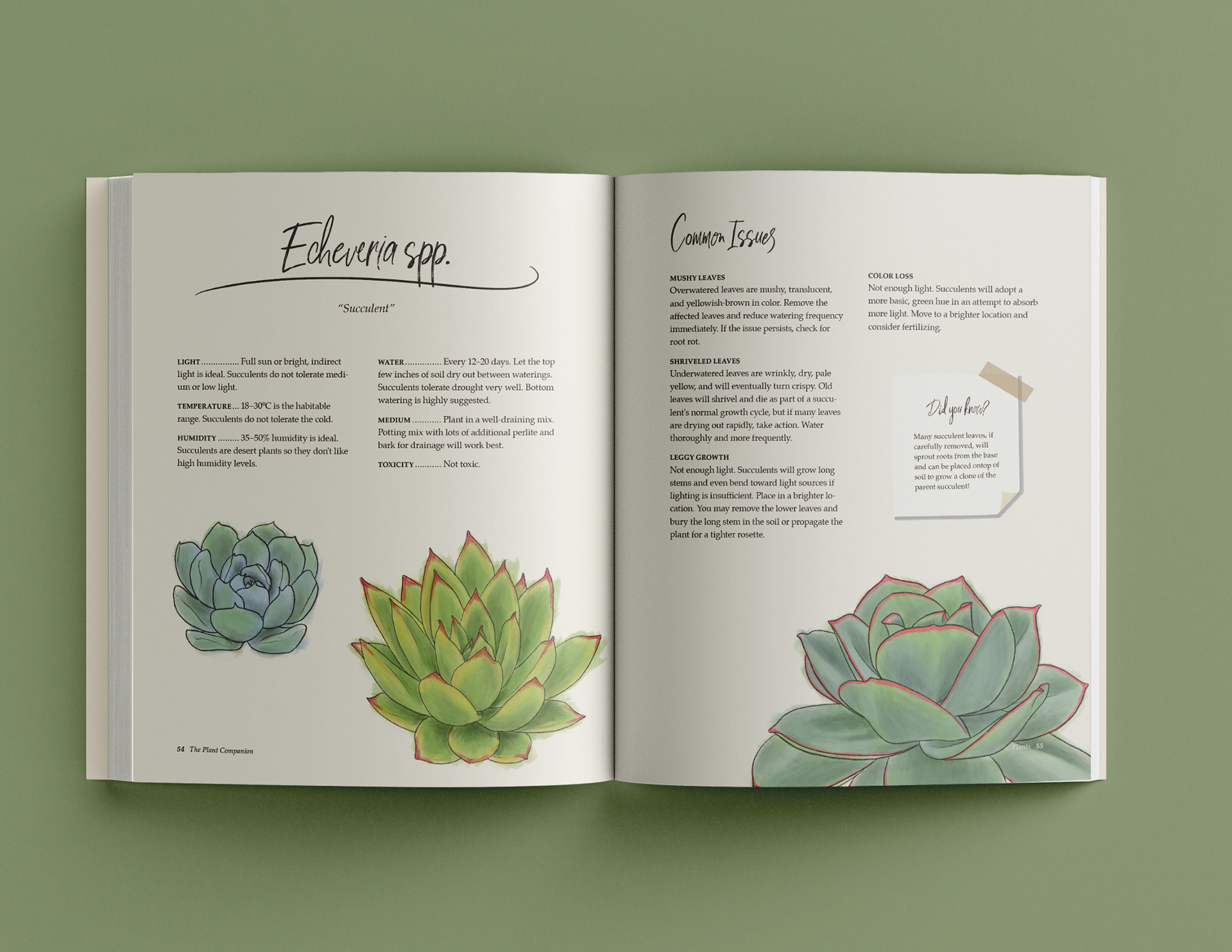
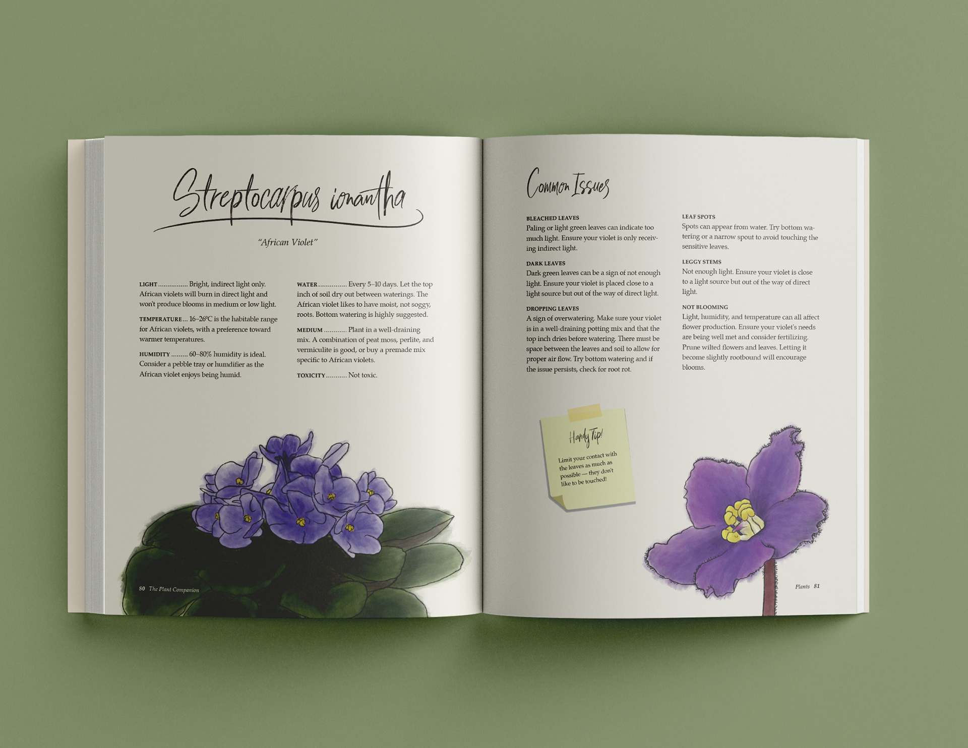
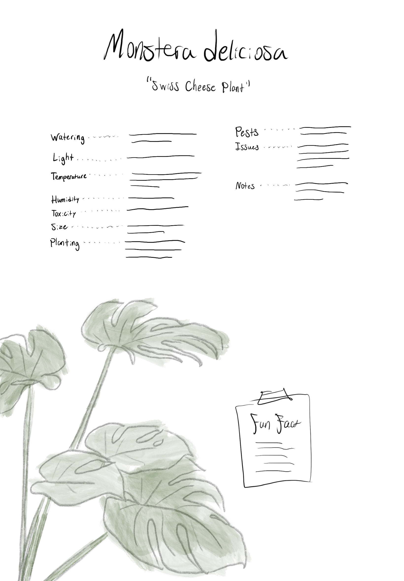
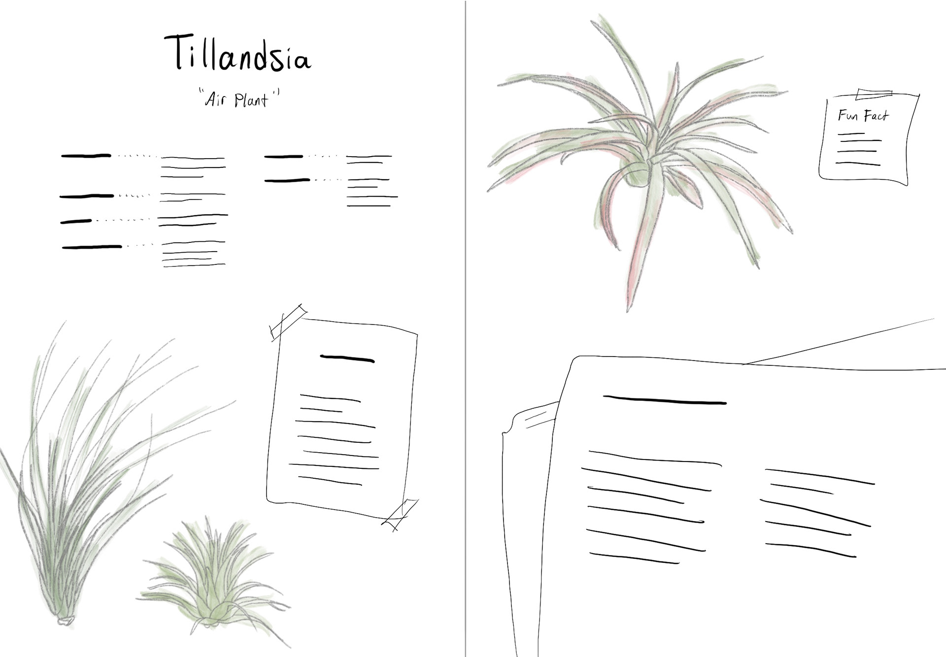
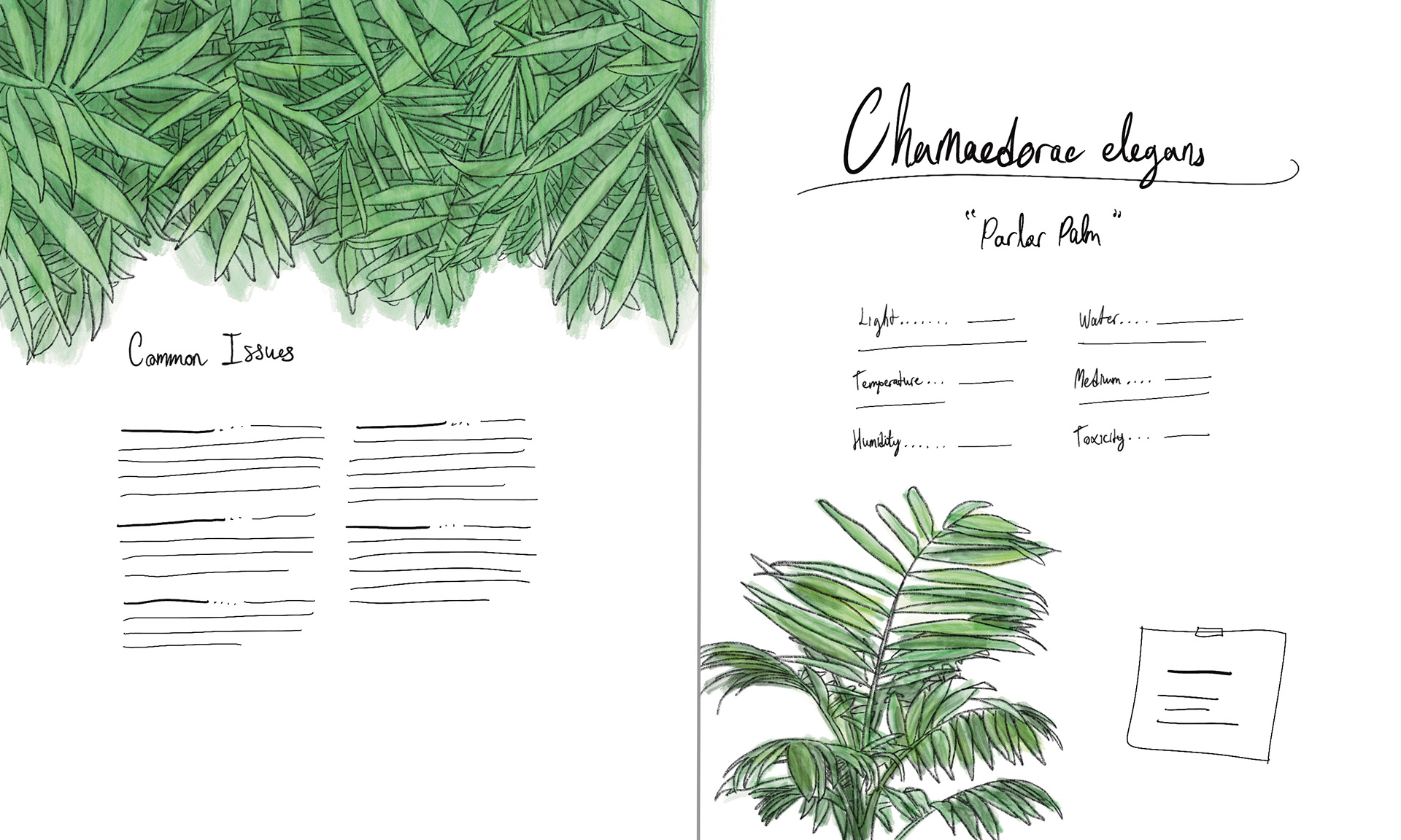
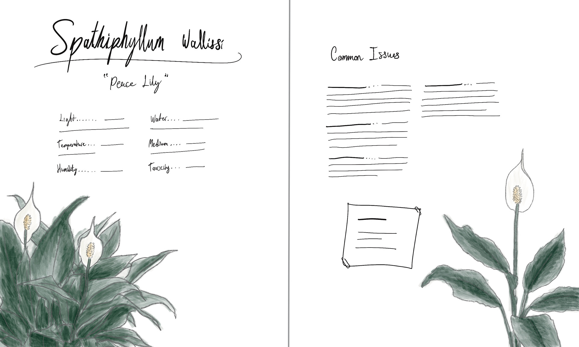
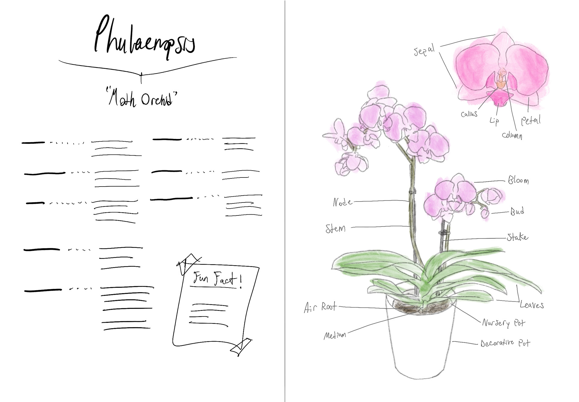
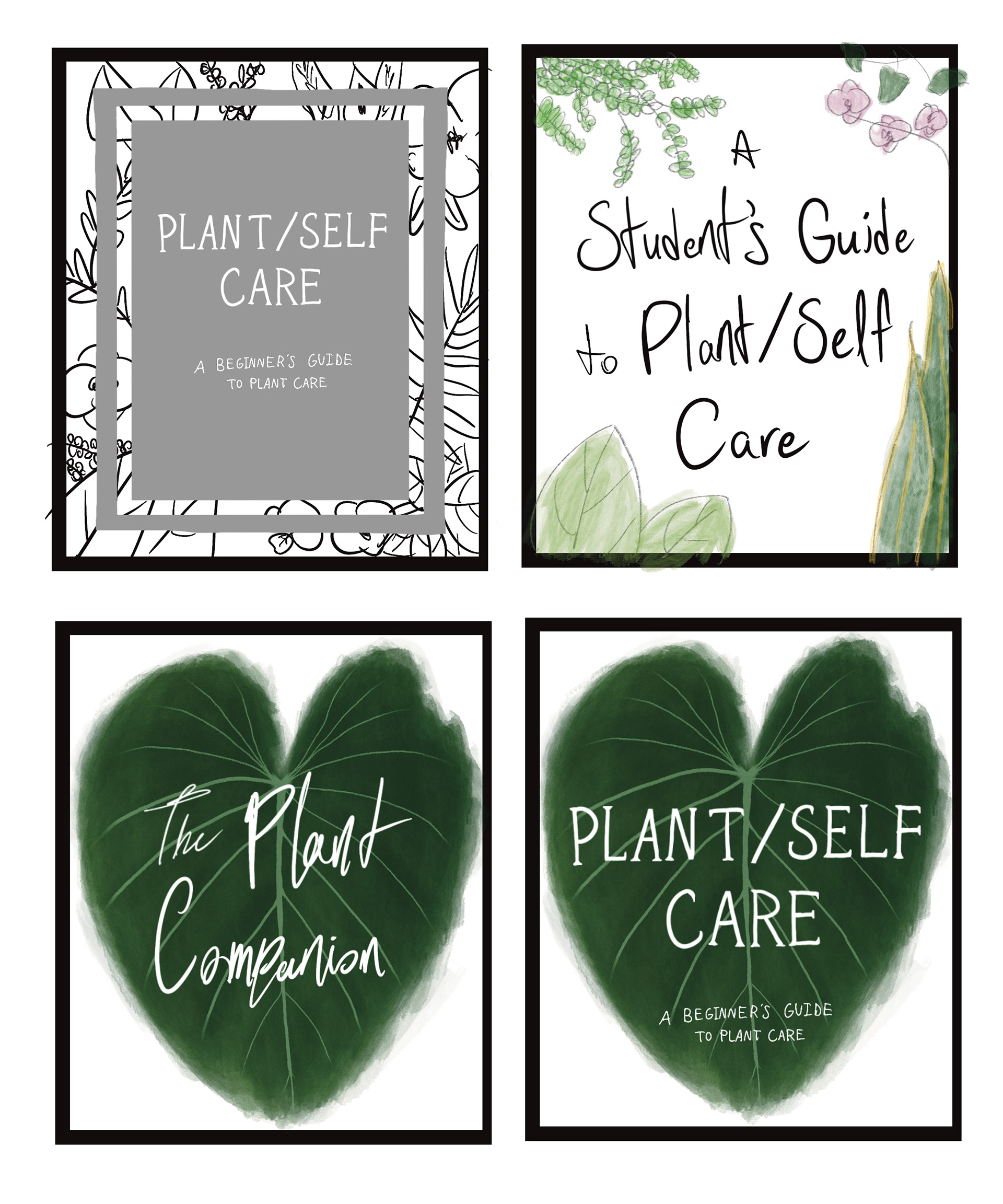
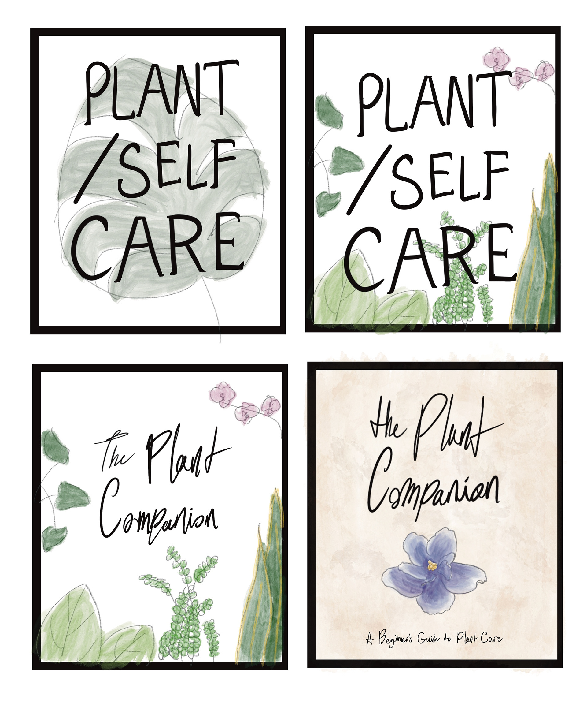
To make plant care easier and more appealing for students, my design outcome will be a book that acts as an ultimate beginner’s guide for students interested in plant care. It will cover the basic care of a wide range of plants that fit the average student’s workspace environment.
The plants included in this guide will exhibit traits that the average student associates with their ideal plant, as discussed in the research results section. These characteristics include:
• A tolerance for low-bright indirect light
• Space-efficiency (plants that grow slowly, mature at a small size, or grow tall rather than wide)
• Watering frequency ranging from every day to once every two weeks
• The ability for regular interaction (eg. misting, watering)
• Leafy green tropical-looking plants
• Hardiness to withstand poor or improper care
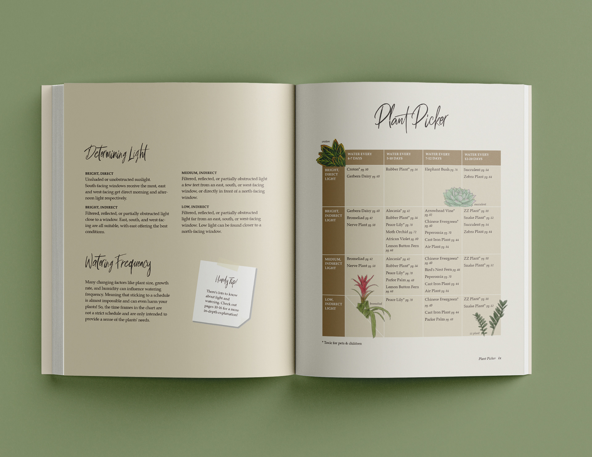
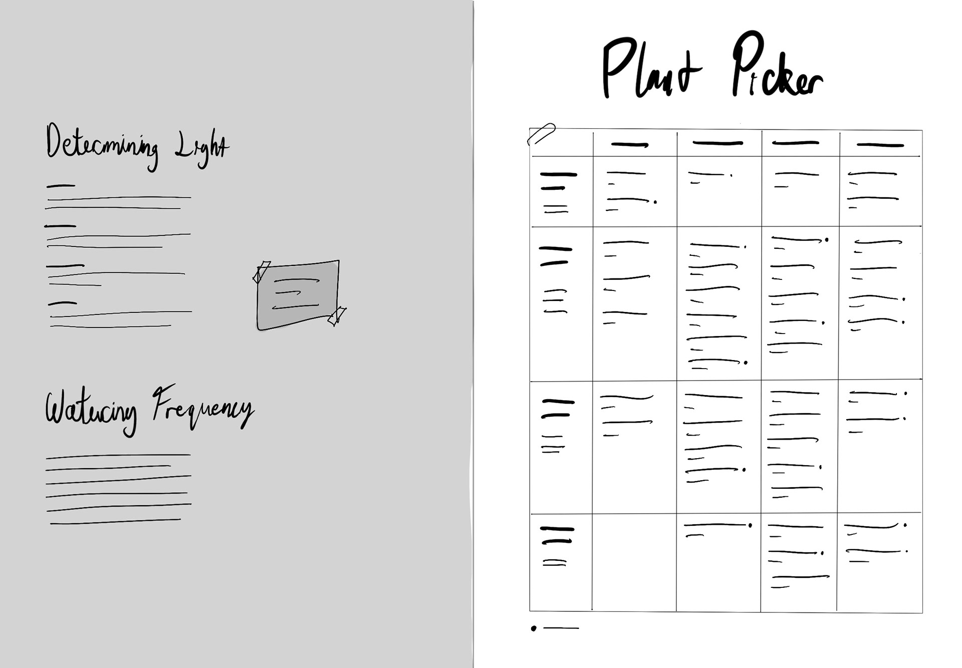
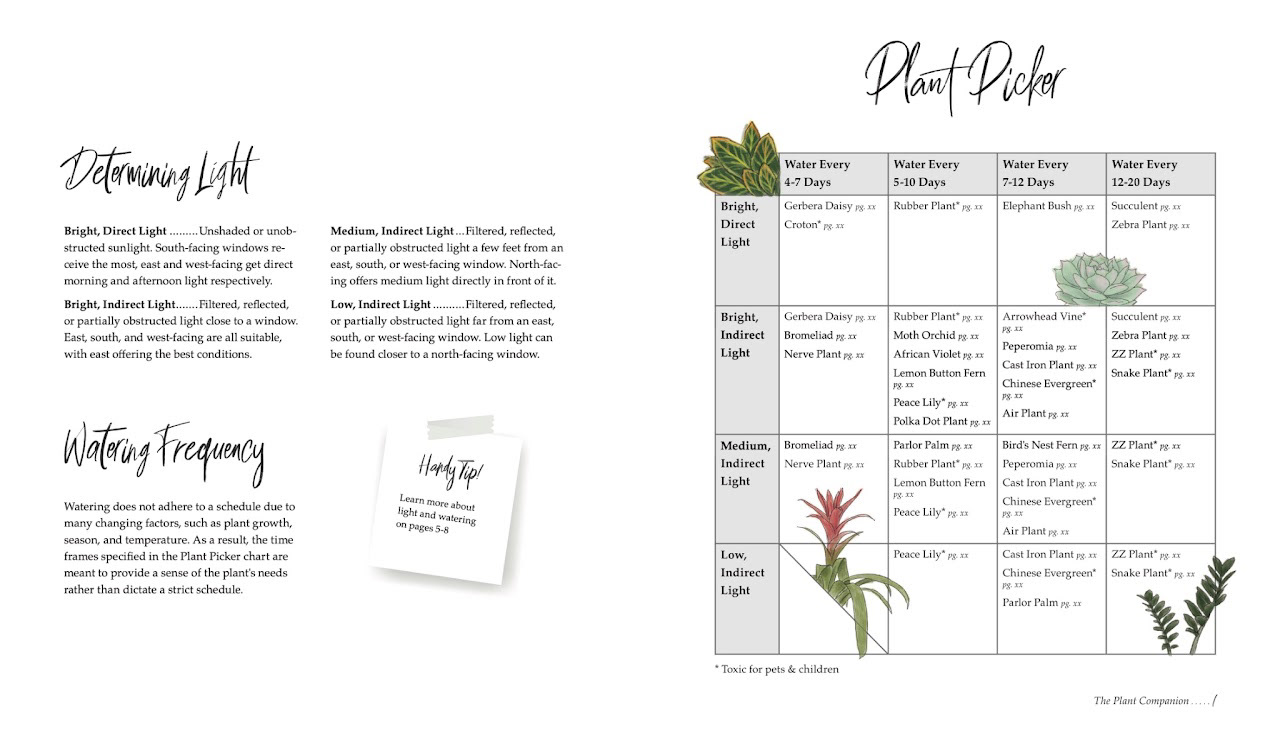
Given that the ideal plant can vary widely, the guide will include multiple species that fit the specified range, allowing every student to find a match for their environment. To help them do this, an alignment chart will be provided at the start of the book. This chart lists lighting requirements, ranging from low to bright, on the top axis, and watering frequencies, from daily to biweekly, on the left axis. At the intersection of these axes, a plant (or two) will be listed along with the page number corresponding to its care guide page. This alignment chart will also help address the issue of students struggling to find suitable plants and eliminate the need to scour numerous lengthy internet sources for answers.
In addition to the individual plant profile pages, sections about fundamental plant care basics will also be included. These will cover topics such as repotting and fertilizing, presented in easy-to-follow step-by-step formats with accompanying illustrations. An additional section discussing the connection between houseplants and mental health will also be included, as many survey respondents reported being unaware of the phenomenon.

Development
Audience Profile
Post-secondary school students, primarily aged 18-29.
Students in this age group are typically the most susceptible to high levels of stress and require opportunities to manage their mental health without demanding too much time or mental load. Offering plants that are small, low-maintenance, and tolerant will fit their at-home learning environments.
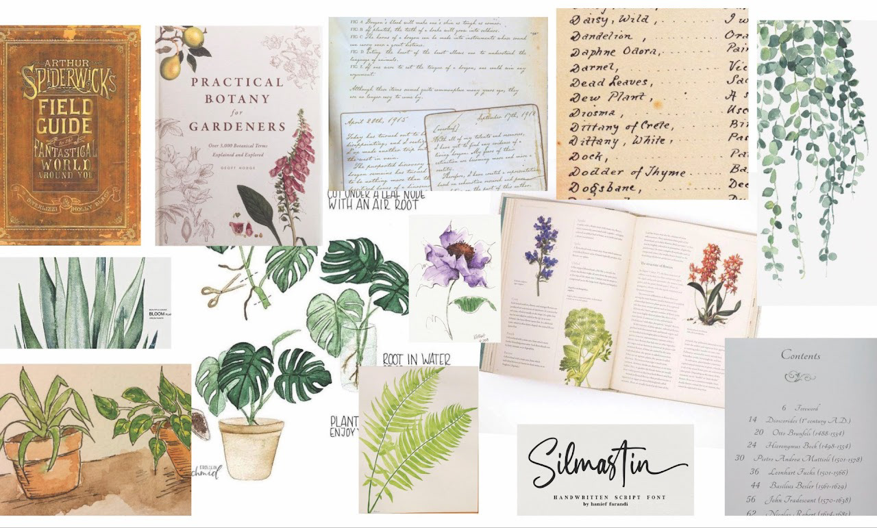
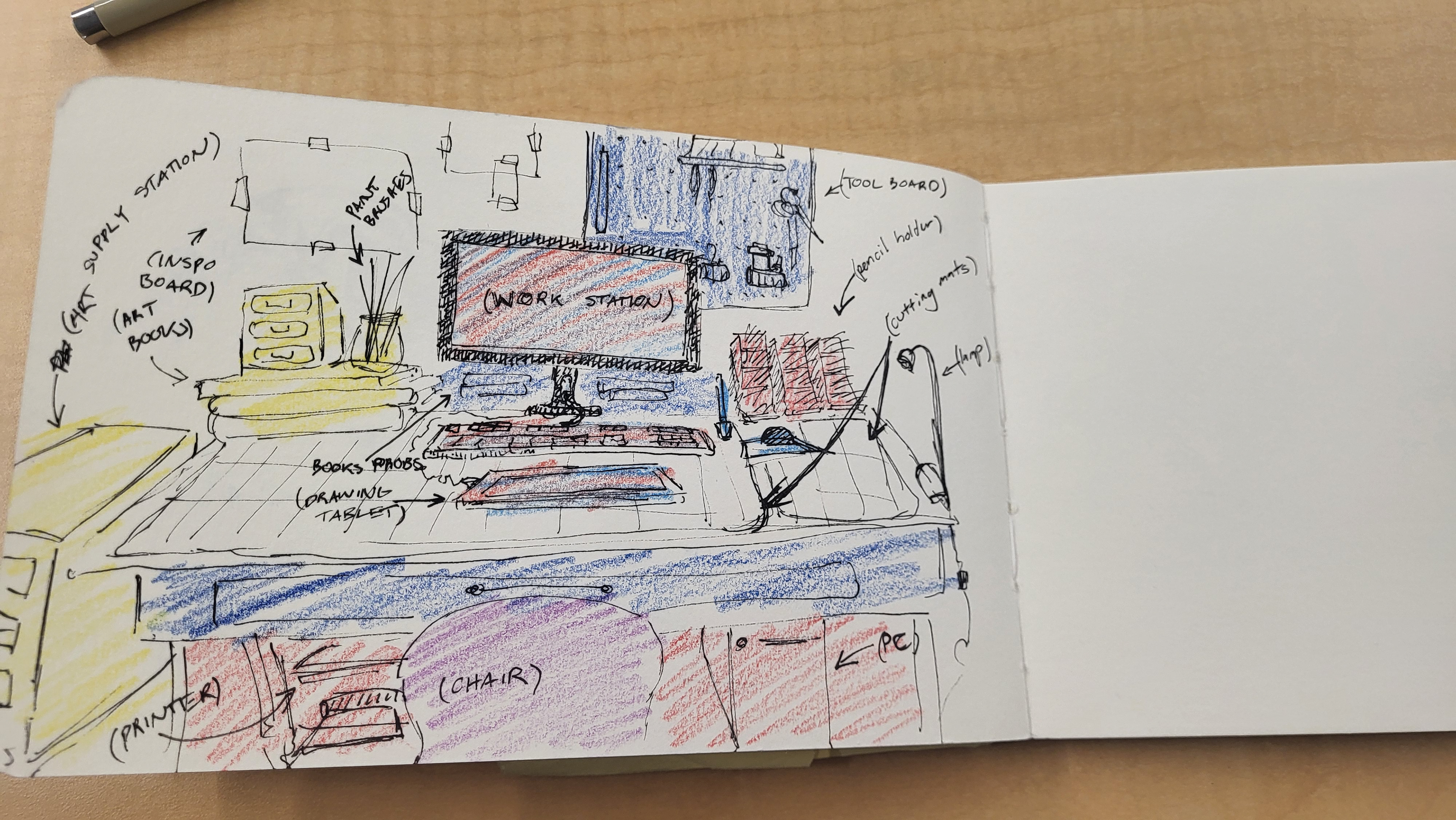
Moodboard
Sketches

Usability Testing
During the “Plant Picker” chart usability testing, students were presented with a unique scenario describing a hypothetical workspace and asked to use a prototype spread to select a plant suitable for the environment. Students then rated the experience's ease and provided written feedback on its usability and visual aspects. Afterwards, I organized all the feedback into an affinity diagram using categories such as typography, hierarchy, illustrations, and the chart itself. The sticky notes are colour-coded based on the ease of the user’s experience, indicating feedback from a user who struggled or one who had fewer difficulties.
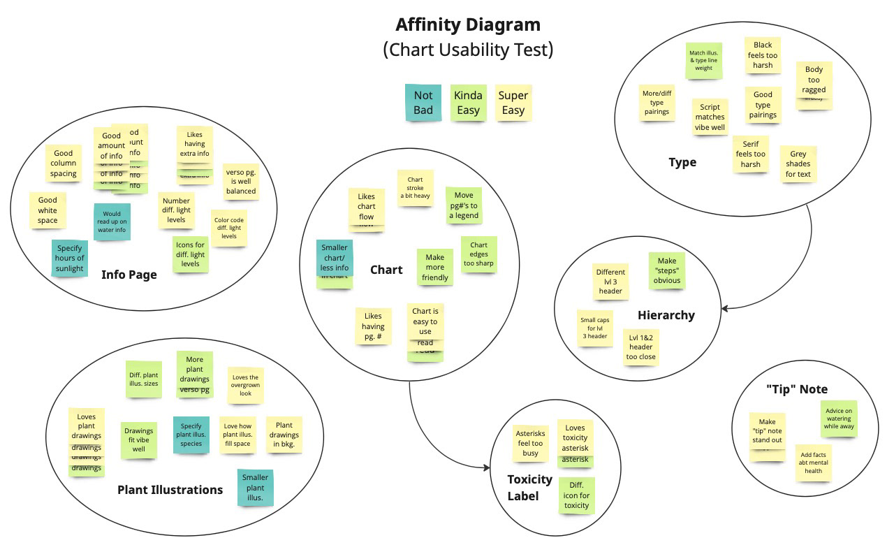
The chart was highly usable, and most users encountered no challenges. Much of the feedback concerned the visual style of the spread. Users found the lack of colour sterile and unwelcoming, despite the small plant illustrations. They expressed a desire for more warmth and friendliness to create a reading experience more conducive to beginners. In response to these suggestions, I removed all black and white from the book and replaced it with tints of brown. Many users also suggested reducing or compacting the amount of information to make it less visually heavy, improving the text hierarchy, and incorporating more plant illustrations.
Additional testing of the plant profiles, cover, and trim size was conducted on a smaller scale. Participants tested the usability and ease of navigation of the pages, providing feedback similar to that of the chart test: incorporating friendlier visuals, more facts, and more mental health-related content.
Conclusion
The Process
Initially, this project took off with a focus on plants and how to take care of them. Throughout my research phase, it began to evolve, becoming increasingly focused on and guided by mental health. This encouraged me to stop thinking about people caring for plants and start considering how plants can help people instead.
When it became apparent during my usability testing that my prototypes lacked warmth and associations with mental health, I began asking myself, “How can I make this a mental health book instead of a plant book?” This question pioneered the edits and refinements I made in my book, guiding me toward a much richer outcome that effectively addressed my goals and problem statement.
Addressing Issues
My research revealed numerous issues students face regarding their mental health. My goal was to bring attention to the benefits plants can offer and encourage more students to incorporate plants into their workspaces.
My research participants cited various barriers and challenges that prevented them from having plants, including a lack of knowledge, a tendency to kill them, and a lack of space. From this data, I knew it was essential to identify specific plants that outweigh this. As a result, the species in The Plant Companion are all small in size, slow-growing, and highly tolerant.
There is a wealth of knowledge to be gained in plant care, which can often be intimidating for beginners. By reducing the massive pool of plant species to pick through and consolidating all the necessary information in one book, the notion of caring for plants becomes less daunting. Creating a publication with content specific to students is the best way to encourage them to leave their computers and homework behind and interact with nature. The Plant Companion makes plant care easy and enjoyable, providing students with a powerful tool to support their mental health.
Form & Aesthetics
The visual style of The Plant Companion is largely guided by my desire to address mental health issues. With my audience being stressed-out, anxiety-ridden students, the reading experience had to be soothing and comfortable. Balanced white space was crucial, providing ample breathing room to contrast the reader's high-energy, busy thoughts. I chose to remove all black and white from my composition, using tints of warm, reddish brown to create both a welcoming feel and a more dated, authentic vibe. I leaned into a hand-rendered style through watercolour illustrations and script typefaces, leading my audience through a more personable, contemplative reading experience.